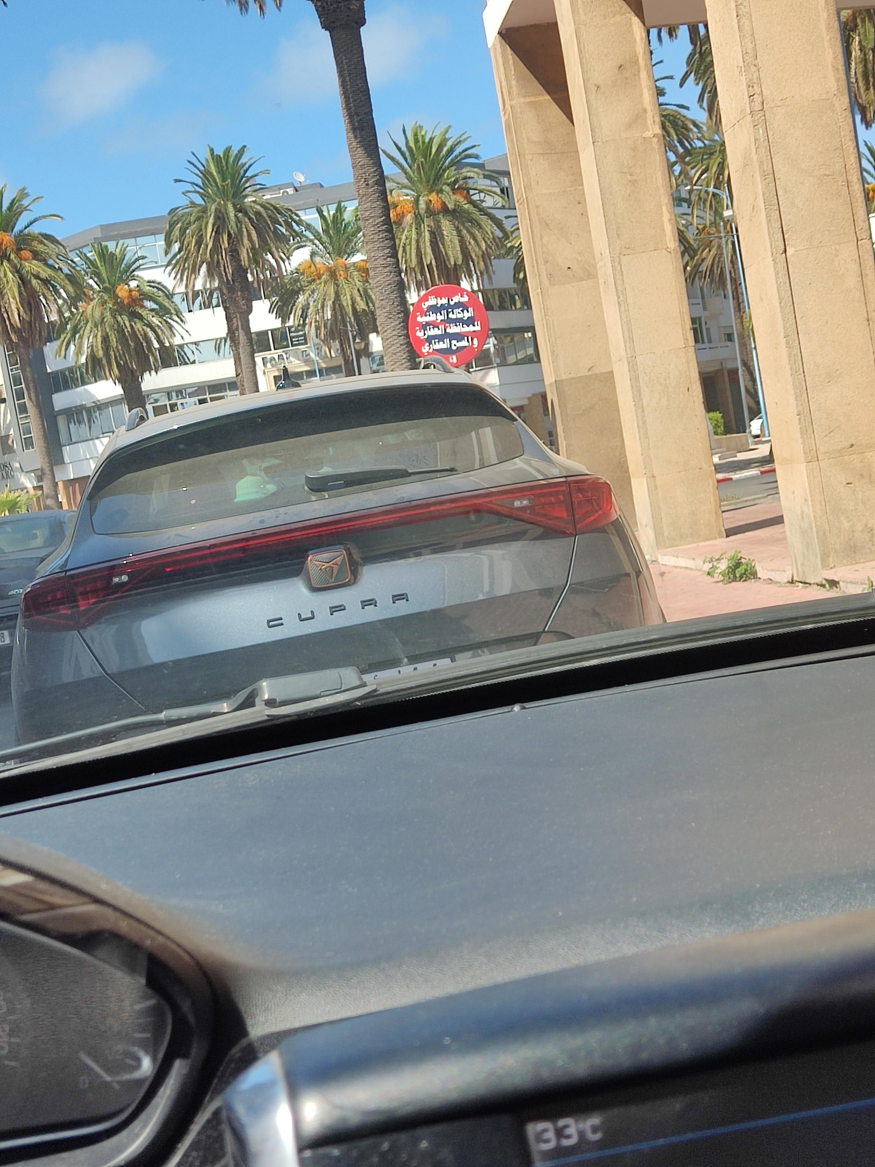
Share Share on Facebook Share on Twitter Pinterest LinkedIn The Cupra emblem looks so cheap by sevenemesis anything with 4 wheelsautosCARSeverything with 4 wheels 9 Comments Slappy_Happy_Doo 2 years ago Looks like a knock off of the Spawn logo PaPa_ZeuS 2 years ago Why does it seem off center to me Huntderp 2 years ago Those cars are sick tho. Idgaf about what it looks like autofagiia 2 years ago It’s a Cupra… but a 150hp diesel CUV Cupra. Knife-Fumbler 2 years ago Your mom looks cheap FlorydaMan 2 years ago Absolutely horrible. And that bronze accents trend already came and went. AnusStapler 2 years ago I don’t know man, any modern car looks cheap as fuck to me. jojowasher 2 years ago reminds me of a gaming computer logo No-Perception1862 2 years ago This cupra looks 10x better than the kia logo. Write A CommentYou must be logged in to post a comment.


9 Comments
Looks like a knock off of the Spawn logo
Why does it seem off center to me
Those cars are sick tho. Idgaf about what it looks like
It’s a Cupra… but a 150hp diesel CUV Cupra.
Your mom looks cheap
Absolutely horrible. And that bronze accents trend already came and went.
I don’t know man, any modern car looks cheap as fuck to me.
reminds me of a gaming computer logo
This cupra looks 10x better than the kia logo.