The biggest car news and reviews, no BS
Our free daily newsletter sends the stories that really matter directly to you, every weekday.
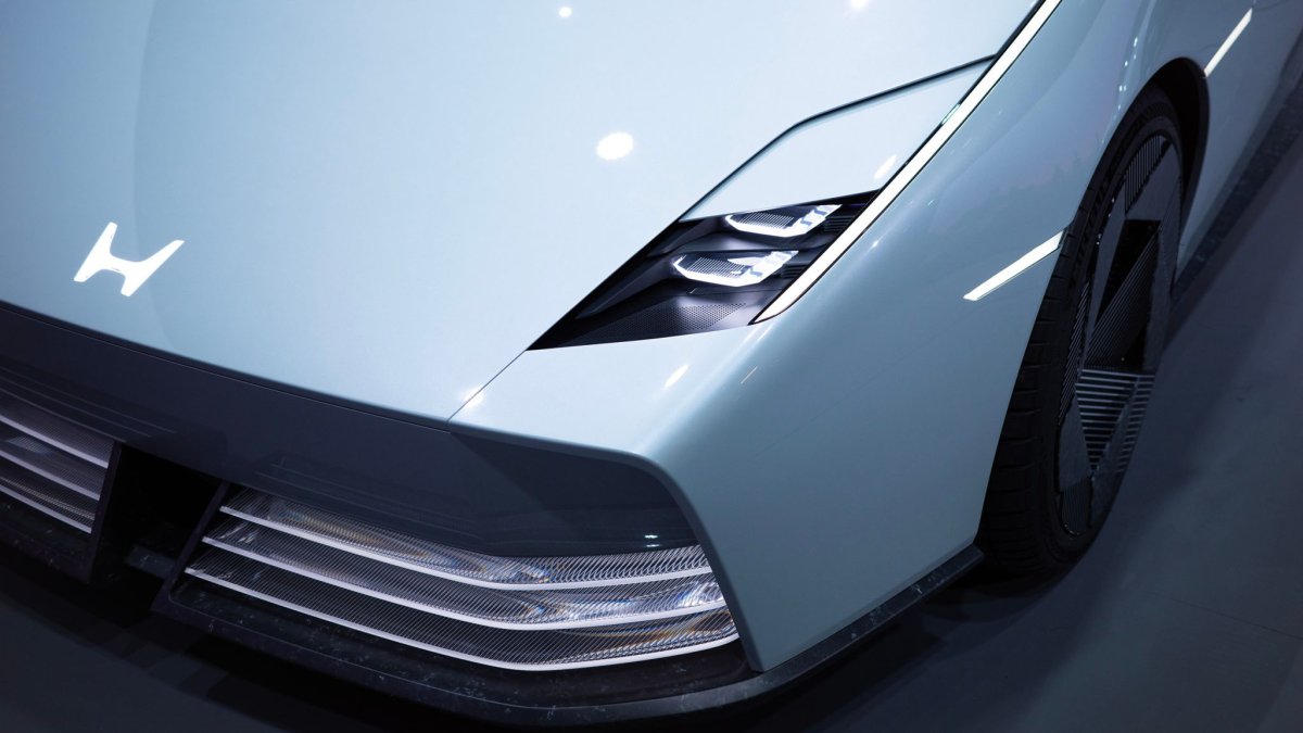
If you’ve been paying attention to Honda’s 0 Series EV concepts over the last few years, you’ve no doubt noticed the new “H” badge they’re sporting. It’s very different from the one found on Honda vehicles for decades, as it’s wider and not framed.
The design actually harkens back to what the company used in the ’60s, and, at least initially, Honda told the world that this new logo would differentiate its upcoming EVs from the rest of its lineup. Today, it chimed in again to say this will actually be the new identifier for its entire automotive division, full stop.
You can still expect to see the new badge on Honda’s first homegrown EVs, landing next year, as well as upcoming hybrids. But we now know, per the company, that the logo will “represent [the] Honda automobile business as a whole, including not only automobile products but other customer touchpoints such as dealership locations, communication initiatives, and automobile motorsports activities.”
As someone who has long admired Honda’s branding and general design sense (we try to forgive the slump in the 2010s), I wholeheartedly support this move. Many automakers have rebranded over the past five years or so, and in plenty of cases, these have boiled down to low-lift “flattenings” that bleed the dimensionality and life out of their visual identities. They’ve varied, though. Porsche’s “new” look, for what it’s worth, was barely noticeable, whereas GM’s looks like something a telecom would’ve floated in 1996.
 Honda
Honda
Honda’s take is different, though. First, it reinstates a great logo from the company’s past with slight changes—always a great move if you have goods like that just lying in the vault. The wider “H” is timeless but also futuristic; it works on an S660 just as well as it does lit up on the fake grilles of the company’s next-gen EVs. Plus, it simply makes sense to treat electrified and non-electrified vehicles the same.
Given the way regulations and consumers are shifting, we’re going to be holding onto internal combustion engine-powered vehicles for probably much longer than the industry believed six years ago. Leaving the old logo on those cars while the 0 Series represents the most cutting-edge tech Honda has to offer frankly makes everything else seem antiquated and less appealing.
My one hope is that Honda doesn’t totally get rid of its block-serif, all-caps “HONDA” wordmark as part of this transition. Again, I love the futuristic typeface that the company is using in tandem with the 0 Series stuff, but there are going to be applications that just fit the serif better, particularly enthusiast products, like the Civic Type R and TrailSport off-roaders. Like red on Championship White, it’ll never go out of style.
But what say you? What do you think of Honda expanding this new badge across its whole repertoire? Let us know in the comments.
Got a tip? Reach out to tips@thedrive.com
Backed by a decade of covering cars and consumer tech, Adam Ismail is a Senior Editor at The Drive, focused on curating and producing the site’s slate of daily stories.

